The Brief
During the 2021 baseball season, Major League Baseball (MLB) and Nike launched the “City Connect” series to shake up the uniform design of seven teams, including the San Francisco Giants. The uniforms are designed to reflect cultural aspects of each team's home city.
Regarding the SF Giants’ design, the team’s EVP, Mario Alioto, said, “We took main focuses for us that really stood out about San Francisco. One of them was the Golden Gate Bridge…and as Mark Twain made famous, ‘the coldest winter ever spent is the summer in San Francisco.’ The fog is what makes our city different."
When the Giants uniform design launched in July 2021, it was met with distaste and disapproval from Giants fans and even some players. Many were unhappy with the bright orange color, as well as the selection of fog as what represents SF. The uniforms have been described as “unfortunately hideous” and “uninteresting, uninspiring and underwhelming all at once.”
The Giants wore these uniforms during every Tuesday home game from 2021-2023. Below is the design that left fans unhappy.
The Challenge
As a passionate Giants fan and San Francisco lover, I was inspired to reimagine new designs to address the fan dissatisfaction with the Nike imagery. I set out to better evoke the uniqueness of being a Giants fan, at the ballpark, in San Francisco. I applied my design process to the selection of clean, timeless, elegant symbols of key aspects of the player and fan experience.
Design Process
I began the design process by identifying the audience who would be most affected by this redesign: the SF Giants team and its wide fanbase. Then, I gathered images and visuals that represent Giants fans, Oracle Park, and summertime in San Francisco. I created the following 3 moodboards:
Moodboard #1
Moodboard #2
Moodboard #3
Based on each moodboard, I created 3 respective stylescapes to further identify the colors, fonts, and themes for each idea.
Stylescape #1
Stylescape #2
Stylescape #3
I selected the first stylescape as inspiration for my final logo design. Attending a game at Oracle Park offers a uniquely scenic, coastal, and vibrant experience. Furthermore, San Francisco is 7 miles by 7 miles, located on a peninsula between the Pacific Ocean and San Francisco Bay. The Bay is also home to the Giants’ beloved mascot, Lou Seal. With this inspiration and thoughts of golden hour at the ballpark in mind, I started sketching.
The Final Design
Finally, I took my ideas to Illustrator.
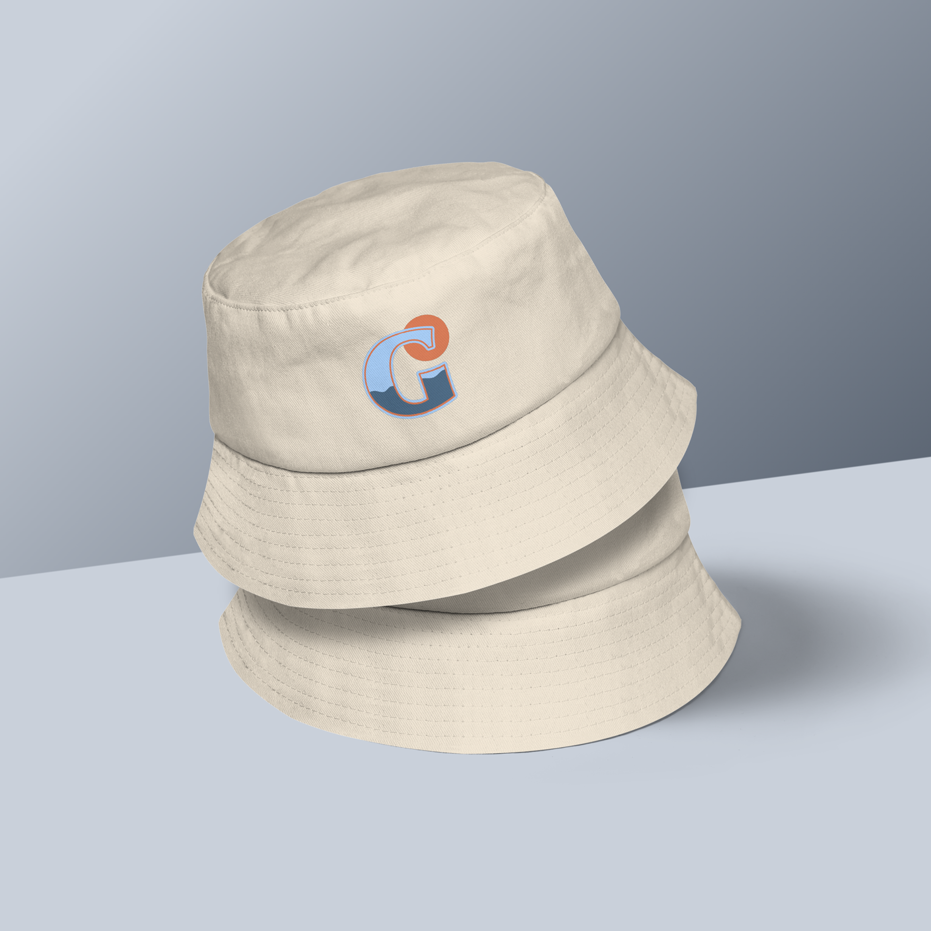
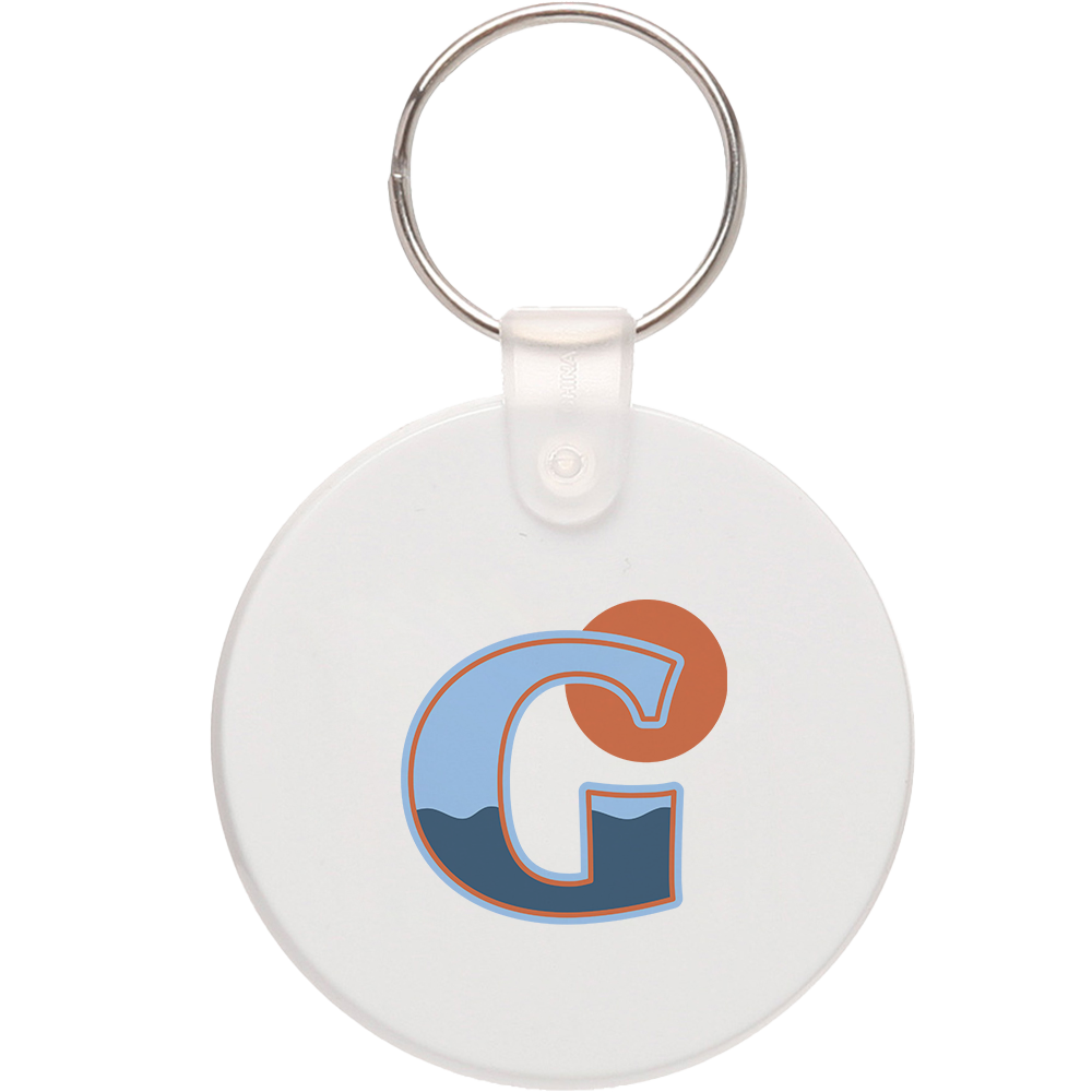
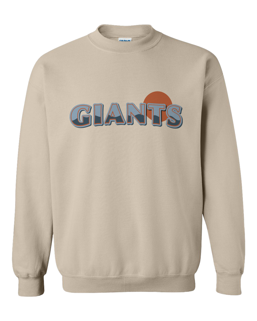
• Wave Illustration: I drew a wave to represent the unique landscape of both Oracle Park and greater San Francisco. The wave has 7 peaks to represent San Francisco’s distinct size. In addition, San Francisco was founded on 7 hills and is sometimes called the “City of Seven Hills”. The wave is also a nod to McCovey Cove, which is part of the SF Bay and located behind the right field wall of Oracle Park. It was named in honor of legendary Giants first baseman, Willie McCovey. Many fans on watercraft will watch the game from the cove.
• Sun Symbol: I included a golden sun as a nod to sunset at the park—a uniquely beautiful experience at this waterside venue.
• Font Selection: I selected the font Optima, which was released in 1958 and happens to be the year when the Giants relocated from New York to San Francisco.


My initial sketch
Appendix
Inspired by my SF Giants: City Connect Rebrand Project, I created this visual to depict a loyal Giants’ fan experience at the ballpark.
Utilizing the same wave illustration and font selection for the City Connect logo, I added a few more touches.
• Foggy Sun: I incorporated SF’s infamous fog, aptly nicknamed Karl the Fog, paying homage to one of Oracle Park’s favorite visitors.
• Palm Tree: Willie Mays Plaza is an area where Giants fans congregate before games. It is dotted with palm trees that are decorated with bright orange lights, which I illustrated for this visual as an ode to the pre-game excitement.
My initial sketch
Willie Mays Plaza lit up at nighttime


